Building the right art style for a game
In this week’s blog post, our art director, Mark Casha, talks about the choices behind our games’ art style.
Whether it’s the bright, tactile beauty of Azul, the richly-painted world of Scythe, or the cute-yet-autumnal cartoon style of Root, beautiful artwork can make a board game stand out on increasingly crowded shelves.
Of course, it’s not just about a board game being beautiful, but about having a strong, distinctive art style that fits and conveys the game’s theme. An art style that works great for one game might be completely wrong for another. Nor is the development of a board game’s art style always approached in the same way.
As a case in point, the processes for two of our games – Posthuman and Vengeance – followed different paths.
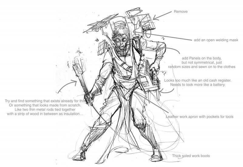
Let’s talk about Posthuman first. Posthuman started with a long process of worldbuilding – something Daniel already wrote about a couple of weeks back. Before I got to work, Gordon had written out a backstory about a post-apocalyptic world of mutants. The basic outline of the world was there – but it still needed to be shaded in.
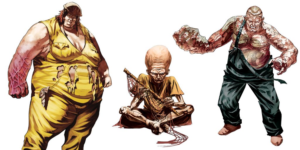
The idea was always that the Mutants in this world are humans, version 2.0 – the next step in evolution and in civilization. Though they could be violent, and they often posed a threat to the player, we didn’t want them to just be snarling, monstrous baddies. As much as was possible within the confines of the game, we wanted to avoid a stark good/evil polarisation – if anything, we wanted to play with prejudice to then surprise the player. To bring this across visually, the Mutants needed to evoke empathy in players, and not just be seen as ‘others.’ For this reason, they needed to retain as much of a human element as possible.
There’s a variety of different mutations in Posthuman – some affecting speed, some strength and some mind. Each category has low- and high-level mutations. Low-level mutations are uncontrolled and unstable, often taking grotesque, mangled forms. High-level mutations are highly controlled, leading to accentuations of qualities: a body-builder on steroids, say, or an uncannily beautiful model with slightly left-field features.
But one thing needed to remain common across the whole spectrum – their faces needed to be expressive, to show human emotions. They needed to show sadness, intelligence, awe and fear: in this way, they would remain relatable, reminding players that, deformed or modified though they may be, they are still humans just like them.
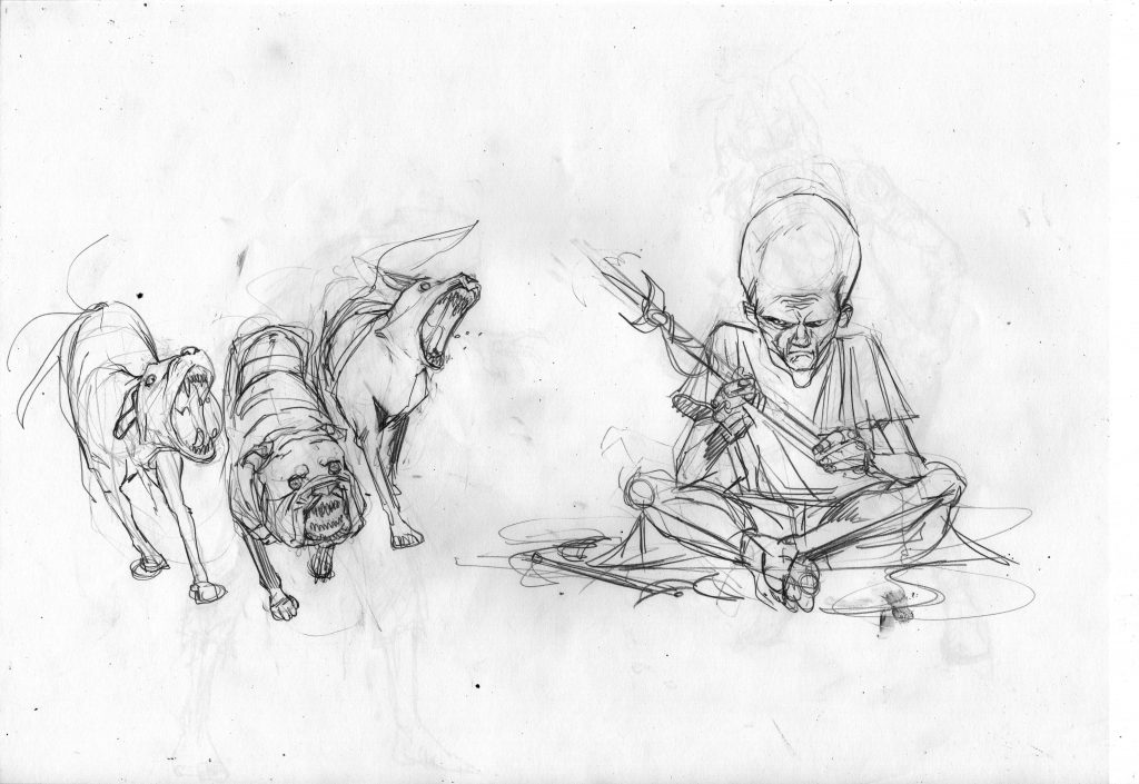
This was the theory – the practice proved harder. The artist we had at the time got the idea but found it challenging creating characters mutated enough to be readable as mutants, while still retaining that human quality. The first sketches ended up going too far in one or the other direction – either looking like entirely inhuman aliens, or simply having exotic features.
The project cycled through a number of artists – Widdershins, Mark Scicluna. In the end, it was Sea Puppy, a friend of ours, who came in to do most of the mutant designs for us. Finally, just before we started the Kickstarter campaign, we found Arjuna Susini – a comic artist whose style was rather different to what we needed, but who proved highly adaptable, doing the art for the characters. I worked with him to get the style we wanted for the game – a quasi-realistic look, with no hint of anything cartoony. Black inks for a gritty look, balanced out with bright pops of colour.

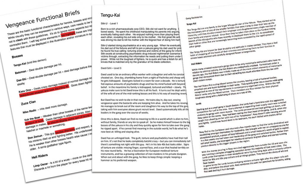
Where Posthuman was approached as a world that needed to be revealed slowly, Vengeance was approached as a trope – an idea and a genre setting that needed to be conveyed with a strong, immediate impact, like a golf club to the head.
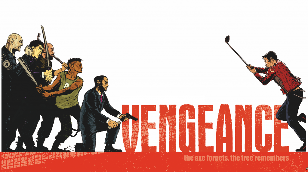
We wanted Vengeance to feel like the board game embodiment of a revenge movie. You know the drill – Kill Bill, Oldboy, blood, grimy back-alleys, dimly-lit corridors, samurai swords catching the glint of flickering neon.
To match that style, Vengeance needed to look hyper-realistic – we wanted an almost photographic look. Very gritty and dark. I looked to Liam Brazier’s animated music videos for Queens of the Stone Age’s Like Clockwork album as another inspiration – I loved their style, though we wanted to aim for something that was less eerie, more grimy and rough-and-tumble.
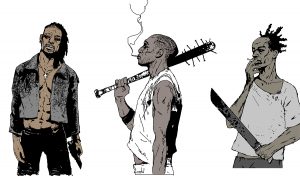
We had an artist in mind – Axel Torvenius – whose style fit that vision perfectly, with his very lifelike character renditions, rough line art and large swathes of solid black and textures. We decided to colour in the spaces in between with bright reds, pinks and greens – both to create a vivid picture of these colourful characters, and to distinguish the different gangs (for this reason, we used the same colours on the gang cards).
Unlike with Posthuman, we started out with more reference material here – Gordon drew on research into different real-life gangs when creating the game’s factions. Torvenius then did an amazing job of using this material as the basis for a rogue’s gallery of goons, bruisers and bosses worthy of any revenge movie.
When it came to the box art, the first ideas were to have a design which was reminiscent of movie posters, using one or sometimes a group of characters under a big, bold title. Eventually, this idea made way for a cover image which better described the game – a lone hero against a whole gang. And what better scene to refer to than the legendary corridor scene from Oldboy? We asked Torvenius to recreate that scene with characters from the game, and then I set it on a clean white background over a blood orange band with the title on top. I made this choice for three reasons: first, because I wanted the figures to pop against the white background, as if they were caught in a graphic novel panel, where time stands still before all hell breaks loose. Second, I wanted the box to stand out when sitting on the shelves in the shops. Finally, I wanted a clean background to offset the grittiness of the art and the theme.
It was the differences in the games themselves, then, that dictated different approaches to their art style: one about the patient unfolding of a world, the other about the visceral hit of familiar iconography. If we’ve achieved our aim, the end result should be distinctive, eye-catching, and true to each game’s spirit.
Author: Daniel Vella
Daniel Vella lectures at the Institute of Digital Games at the University of Malta, where he teaches courses on narrative in games, player experience and the formal properties of games. He studied literature before following a PhD at the Center for Computer Games Research at the IT University of Copenhagen. His research blends game studies, philosophy and literary theory, touching on a wide range of topics: from developing a theory of subjectivity in virtual game worlds, to examining aesthetics of the sublime and Romanticism in Dark Souls.

